
After countless hours of gathering data, analyzing patterns, predicting trends, and gaining insight, there’s still that looming, final piece of the puzzle: Data presentation. Presenting all your data and related information in a cohesive, visually appealing way can feel like a big, unpleasant, yet unavoidable hurdle.
With Google Data Studio, you can quickly design beautiful, comprehensive reports, and save your energy for what you do best.
What Is Google Data Studio?
Google Data Studio is the newest addition to the Google Analytics 360 Suite. This tool makes it easy to pull all the information from your data collection programs into one centralized dashboard to deliver a live, visually appealing, and interactive report. These reports are detailed enough for internal use with a team, and clear enough to be equally valuable for client reporting. You can create smart, rolling, and cohesive reports that display your data in a way that’s easy to see and comprehend by people of virtually all levels of understanding.
Benefits Of Google Data Studio
Fully Customizable
Google Data Studio makes building customized, readable, and branded reports easy. When you sign up for Google Data Studio, the program starts you off with a blank canvas upon which you can build your report. You are not confined to pre-programed templates, but instead, you have the ability to drag and drop information and add charts and widgets to create a fully customized report, best fitting your unique reporting goals.
As you create your report, you can choose from a number of colours, fonts, and page formatting options to make design choices that seamlessly replicate your company or client’s branding; you can even upload a logo. Building a report that visually represents your company or client is a great way to personalize your reports to show professionalism and care; Google Data Studio makes that easy.
You can also choose from a number of built-in charts to help display your data in a way that wasn’t previously achievable through other data reporting programs like Google Analytics. You can customize the timeframe for each chart by selecting a custom timeframe or a rolling timeframe.
- Custom timeframe: You can select a fixed period of time to show data over a specific date range. This is a great feature (for example) for delivering monthly reports, or showing a month over month change.
- Rolling Timeframe: A rolling timeframe allows you to measure data over a window of time in relation to when you view the data; for example, a chart reporting on Top Page Views over the last 28 days.
These built-in charts can be useful for visually displaying data in whatever way you think is best. Here are a few use cases.
- Using a pie chart to show Demographic percentages.
- Using a line chart to show Sales month over month.
- Using a bar graph to display Website Traffic from last year vs. this year.
- Using a geo map to show Sessions by country.
All of these graphing options (along with area charts, scatterplots, and bullet graphs) are available on Google Data Studio with just a couple clicks.
For those more focused on the data than creating something neat and organized, Google Data Studio also provides pre-made templates for drag and drop scenarios. Below are a few examples of the templates Google Data Studio provides:
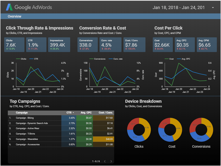
The report below shows data sourced from Google Ads (previously Google AdWords) to report on the success of a Pay Per Click Campaign.
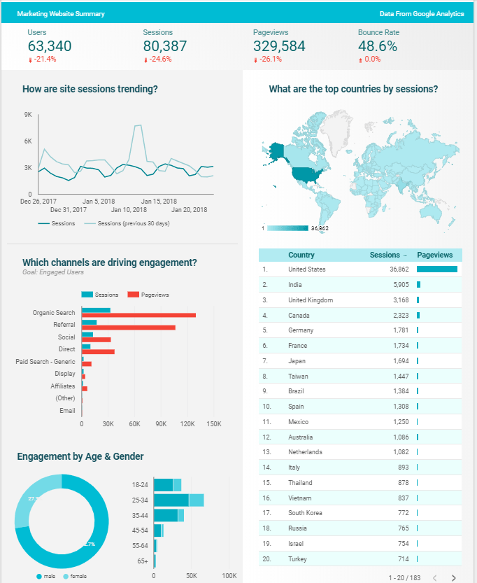
This report draws data from Google Analytics to show detailed demographics and behaviour information to report on site traffic data and trends.
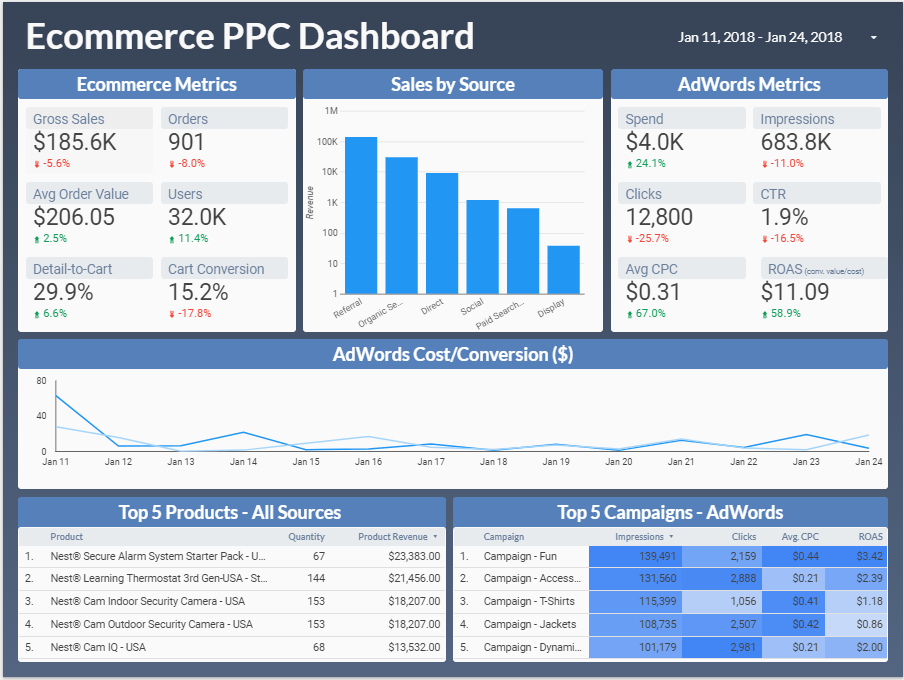
The report below shows a report of the data collected from a Google Ads Pay Per Click Campaign as it relates to E-commerce.
Expand The Data You Show
With Google Analytics, your data collection is limited. Each dashboard only lets you add a maximum of 12 widgets for reporting, and 10 rows of data per table. With Google Data Studio, you are no longer bound to a certain number of widgets. You can add unlimited charts and tables, with unlimited rows of data, showing your client or team the whole picture.
In addition, and arguably one of the most groundbreaking features, Google Data Studio gives you the ability to pull data from multiple sources into a single report. All you have to do is link each of your charts to their data collection source, and they’ll be displayed side by side on the same dashboard. Another appealing feature of Google Data Studio is that any updates to the chart source are updated in the report in real time to ensure report accuracy. All of this happens automatically, so you can be virtually hands-off after you initially secure the link.
In Google Data Studio, you can seamlessly source data from a number of different data collection programs, including:
- Google Ads
- Google Analytics
- YouTube
- Attribution 360
- Soundcloud
- Google Sheets
Google Data Studio also gives you additional data sourcing options by supplying “connectors”. When you use a connector, you can pull additional data from any of the following platforms:
- AdRoll
- Bing
- CallRail
- MailChimp
- Salesforce
Sharing Capabilities
Google Data Studio is designed to have optimal collaboration capabilities. Similar to a Google Doc, you can easily share your report with others by just sending them a link. You can also control how each user can interact with the document by assigning viewing and editing parameters. This gives you the ability to easily share and collaborate with clients and teammates without having to share password information that would give them complete access to your Google Analytics account. This way, they will see only the information you choose to share with them on Google Data Studio.
Google Data Studio is truly a groundbreaking tool for digital marketers. There is nothing else that parallels this tool on the market today. Google is leading its industry by providing fully customizable, visually appealing reports that can be tailored to fit your needs. This program is streamlined to update in real-time, easy-to-use, and easy for your clients, teams, and colleagues to understand. Stop laboring over excel spreadsheets and manual diagrams, and start creating professional reports using Google Data Studio.